The Air Mag Cover is a USA designed Cabin Air Filter Magnetic Cover for the Tesla Model 3.
In these times, we all have become more and more concerned about the quality of the air we breathe. The condition of your Cabin Air Filter is more important that ever. Changing the cabin air filter in your Tesla Model 3 is not an operation that was designed to be easy to do until now. This new and unique product allows you spend less time on the job which makes it possible for you to do it as often as you like.
This cover makes it easier to service your Cabin Air Filter. Tesla's Cabin Air Filter. Replacement is normally serviced by Tesla personal. This product makes the job much easier for the owner/ home mechanic to perform.
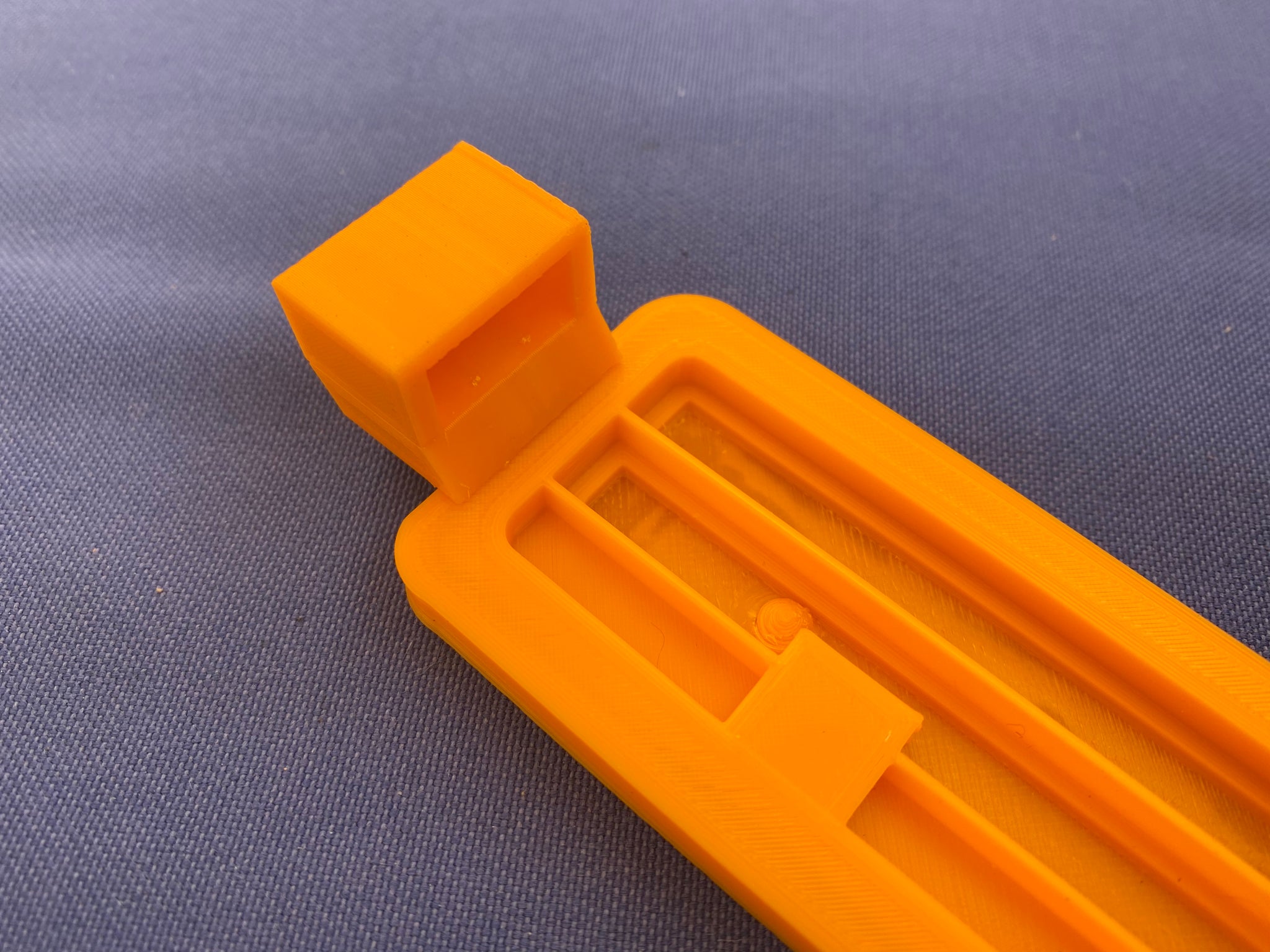
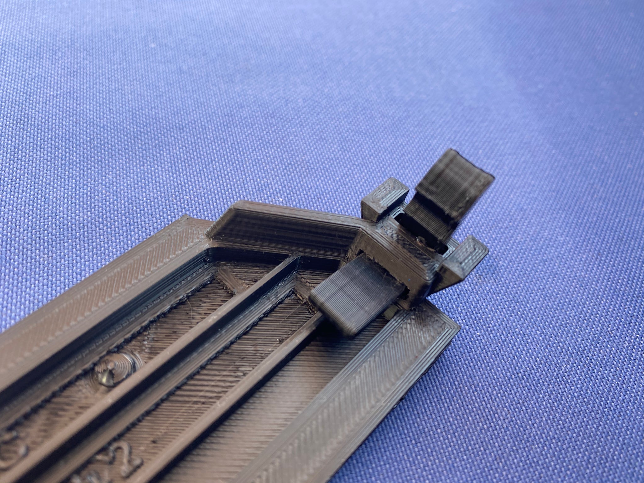
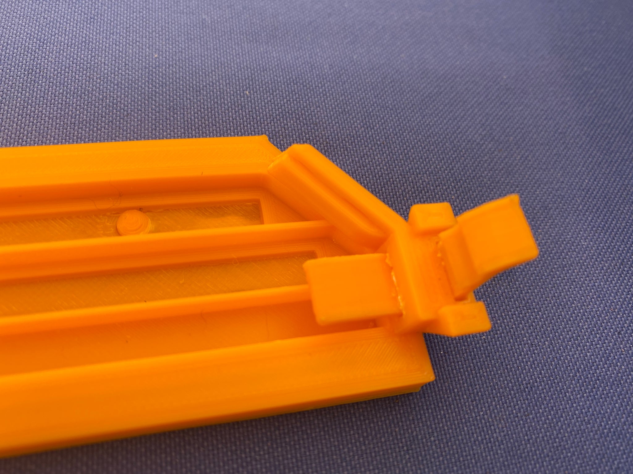
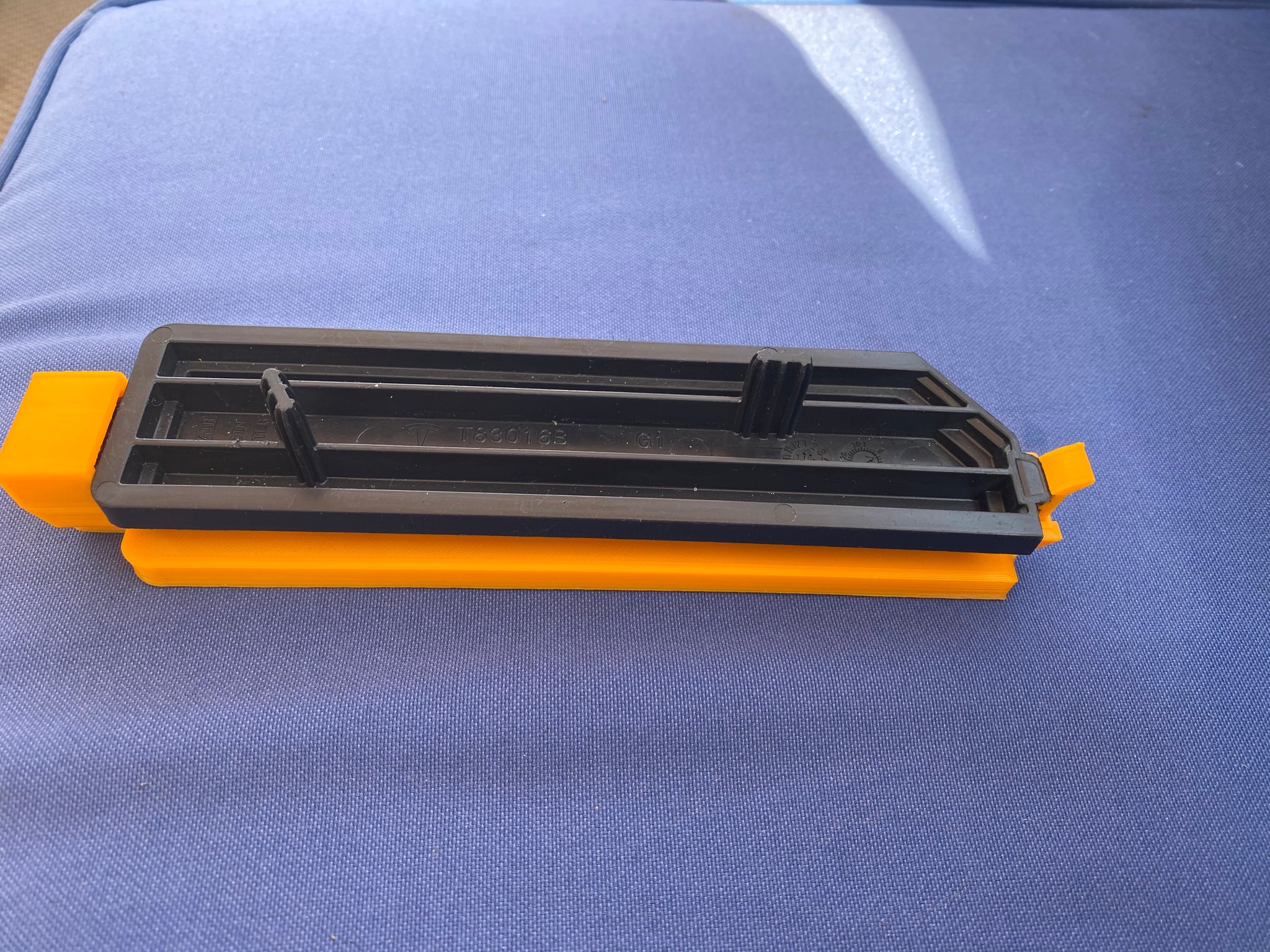
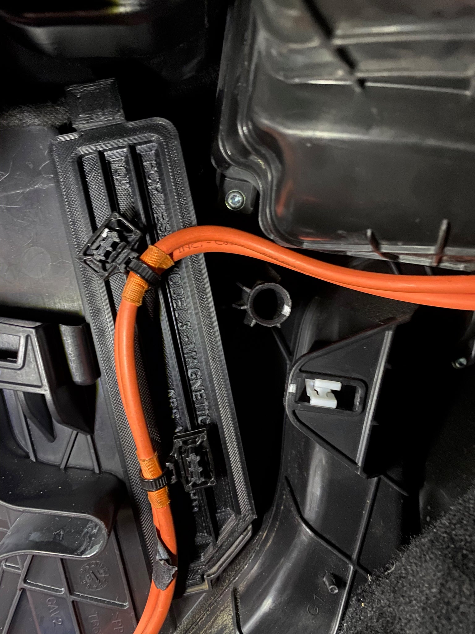
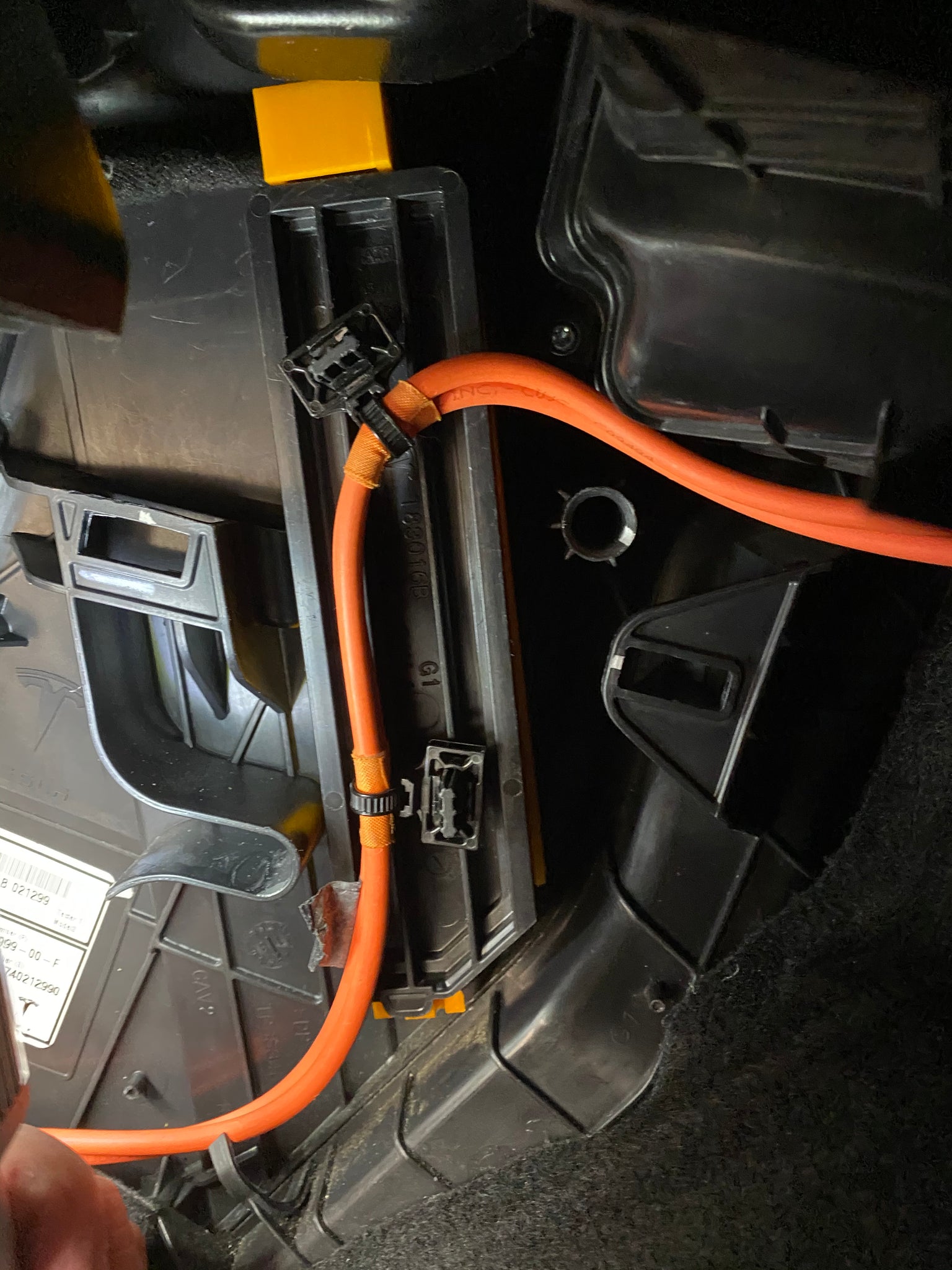
The original factory cover uses a screw to hold it in place which is difficult to access.
This new cover is functionally the same as the factory cover but uses a strong N52 Neodymium magnet to hold it in place instead of the screw. To remove this cover, all you have to do is grasp it and pull it off. To install, simply press it on. Once secured, will not come off on its own.
Your original cover also has the job of supporting a high voltage cable and we don’t want to disturb that. So this new cover acts as a carrier for your original cover. You simply clip your original cover to the to the top of your new cover. Basically, you’ll have a magnetic cover sandwich which supports the HV cable as before.
The first installation of this cover will involve the same amount or work that you'll encounter in a normal cabin air filter servicing. But after that, cabin air filter changes will be easier. Some of its features include:
Magnetic installation and removal
Eliminates wear and damage from removing/tightening the screw
Encourages owner to keep their Cabin Air Filters fresh by making the job easier to perform
Shortens the amount of time to get the job done
Available in "original look" black or "easy find" orange
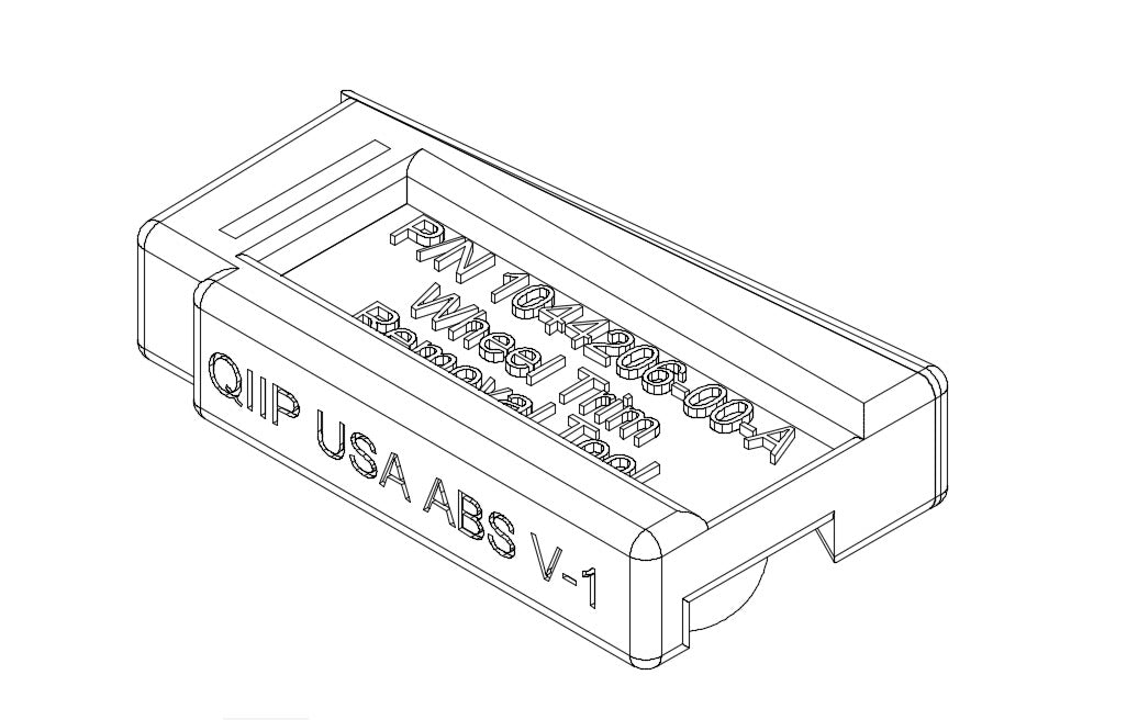
Construction: 3D printing in ABS material.
Fastening: Strong N52 Neodymium magnet
I am 3D printing these until demand exceeds my capacity to produce them. These are produced in the USA with care using durable ABS plastic and at the highest quality possible.
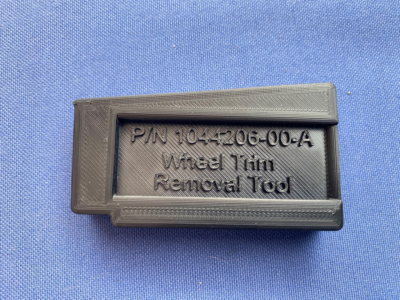
The Wheel Trim Removal Tool - Enclosure is a USA designed modification for your Tesla Model 3.
Free Shipping with Air Mag Cover Purchase
Enclosure for “Wheel Trim Removal Tool” for Tesla Model 3 with 19” or 20” wheels. This could be the cheapest Model 3 upgrade ever!
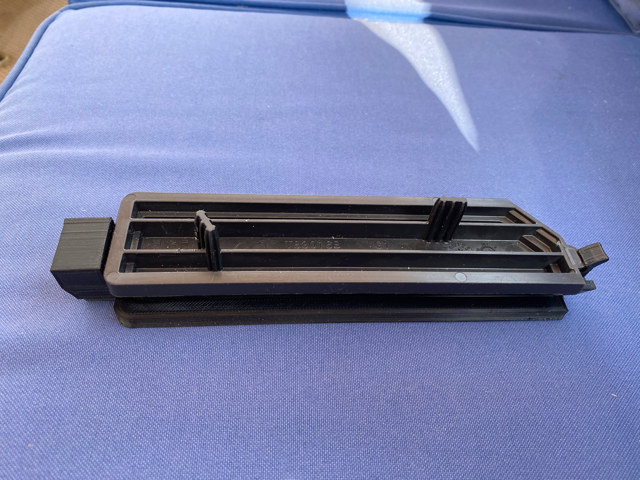
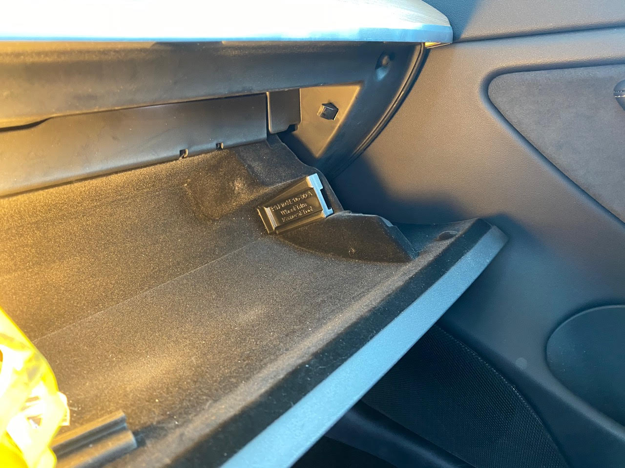
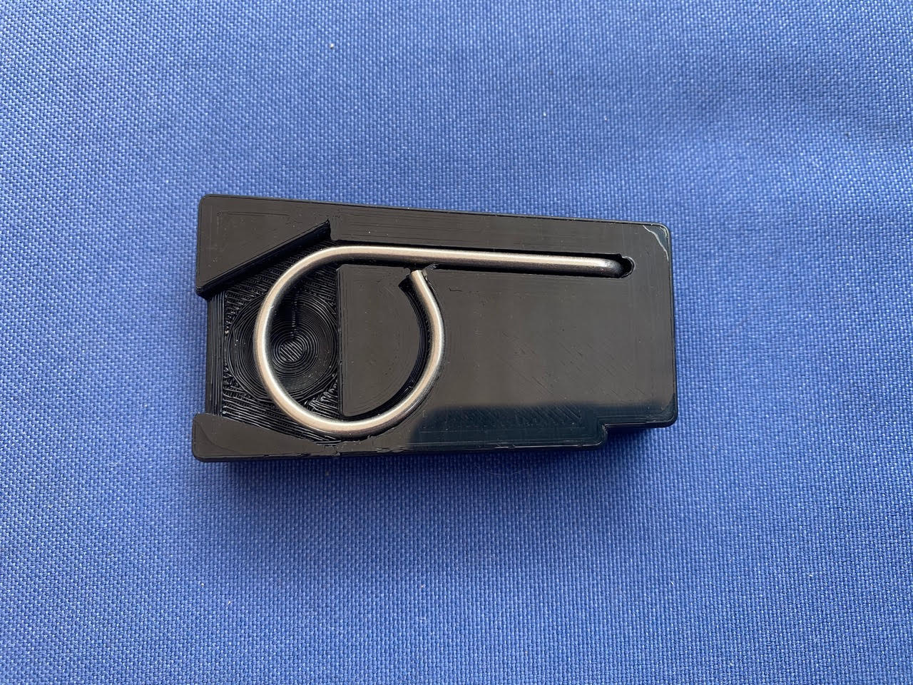
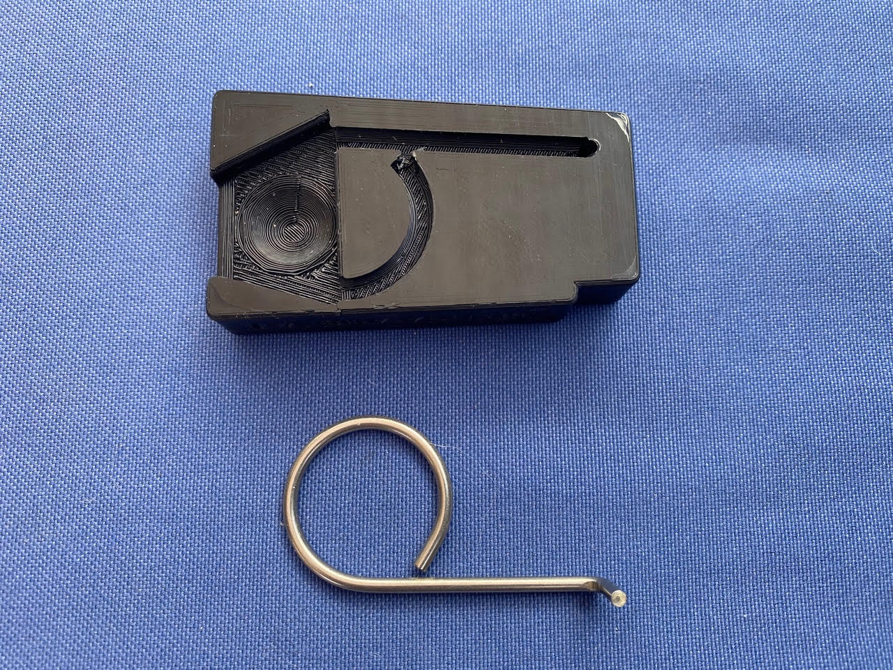
The Problem: The Model 3 (19”/20” - Wheels) comes with a little tool for removing the wheel center trim. This tool is stuffed in a little zip-bag and thrown in the glovebox at the factory (see photos). The whole thing is rather janky and not befitting of a premium car.
Over time, you are likely to lose this tool or not able to find it when you want to use it.
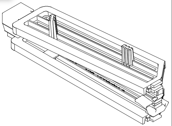
The Solution: This is a enclosure or a carrier for the “Wheel Trim Removal Tool” which is designed to neatly solve this problem.
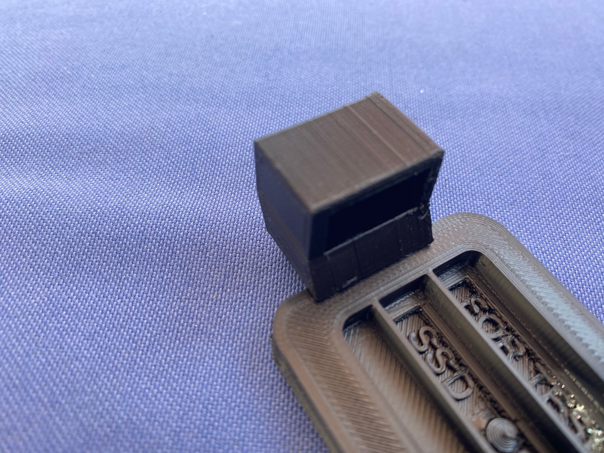
The tool snaps neatly into one side of the carrier. The carrier then fits into a little unused recess in the right side of the glove box. It seems Tesla created a little wasted space which can now to be put to use. There is part number text on the original zip bag, this has been reproduced on the face of the carrier. The tool is held in by its own spring force. There is a recess for your finger to make it easy to pull on the tool to release it.
Designed and Manufactured in the USA / 3D printed in strong ABS material.
The Result: There is the old rule “A place for everything and everything in its place”. Premium car makers generally follow that principal. Your tool will now be in its place, easy to find when you need it, and wont get lost over time.
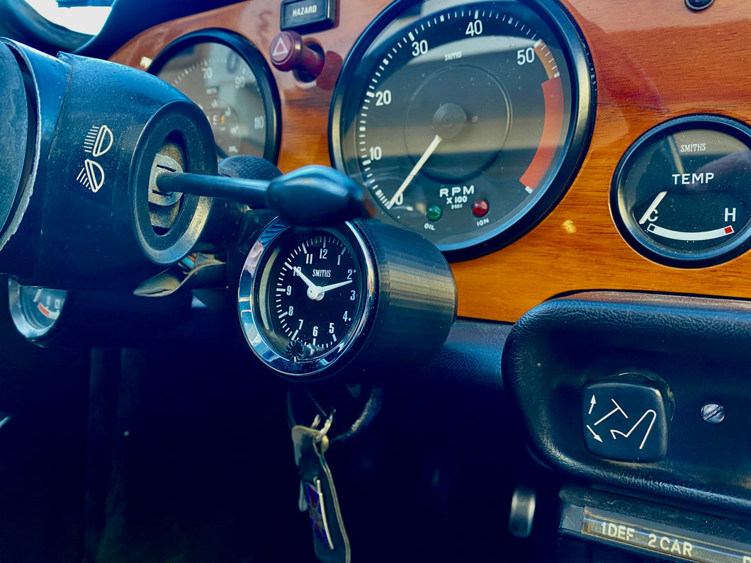
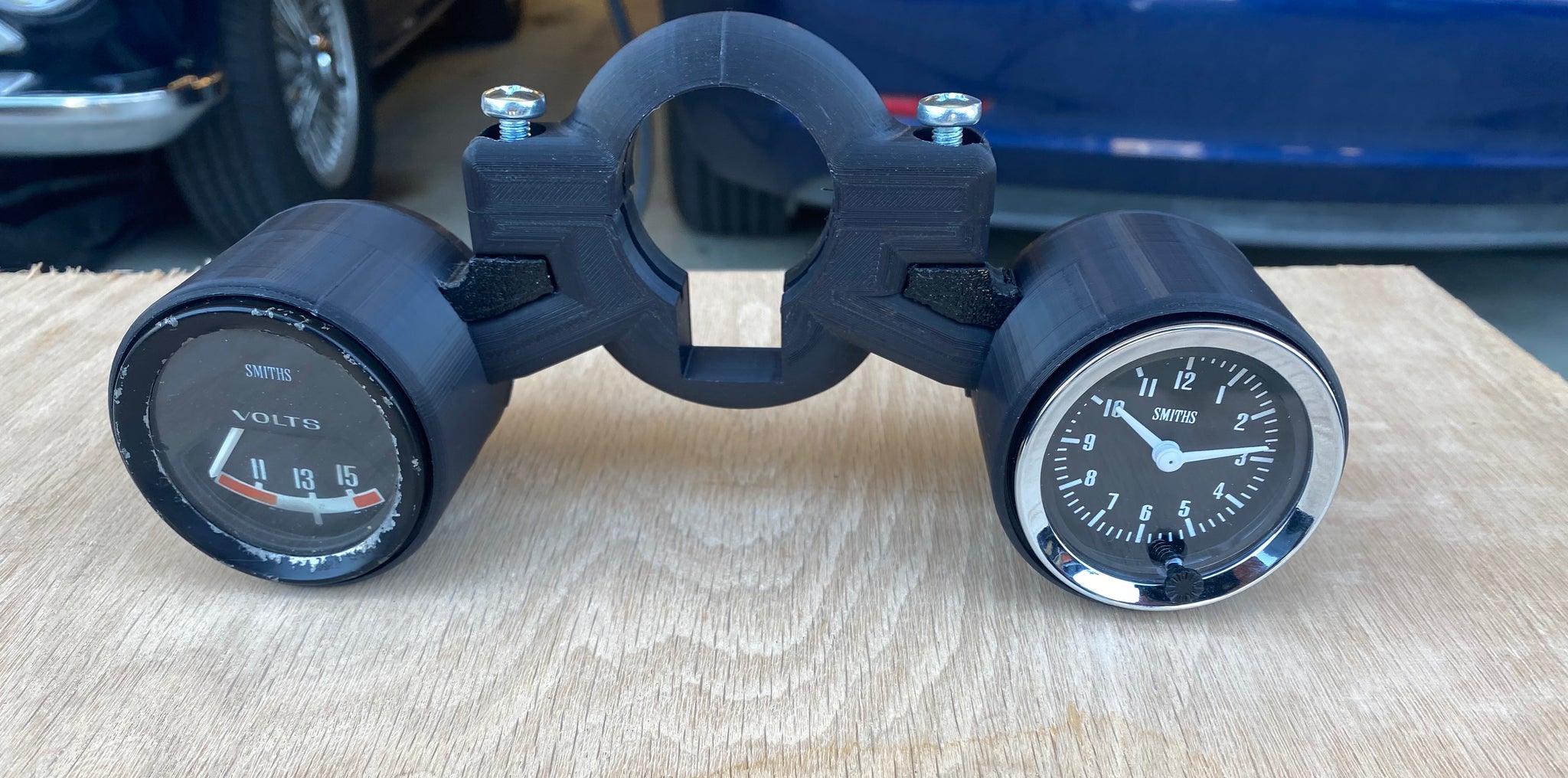
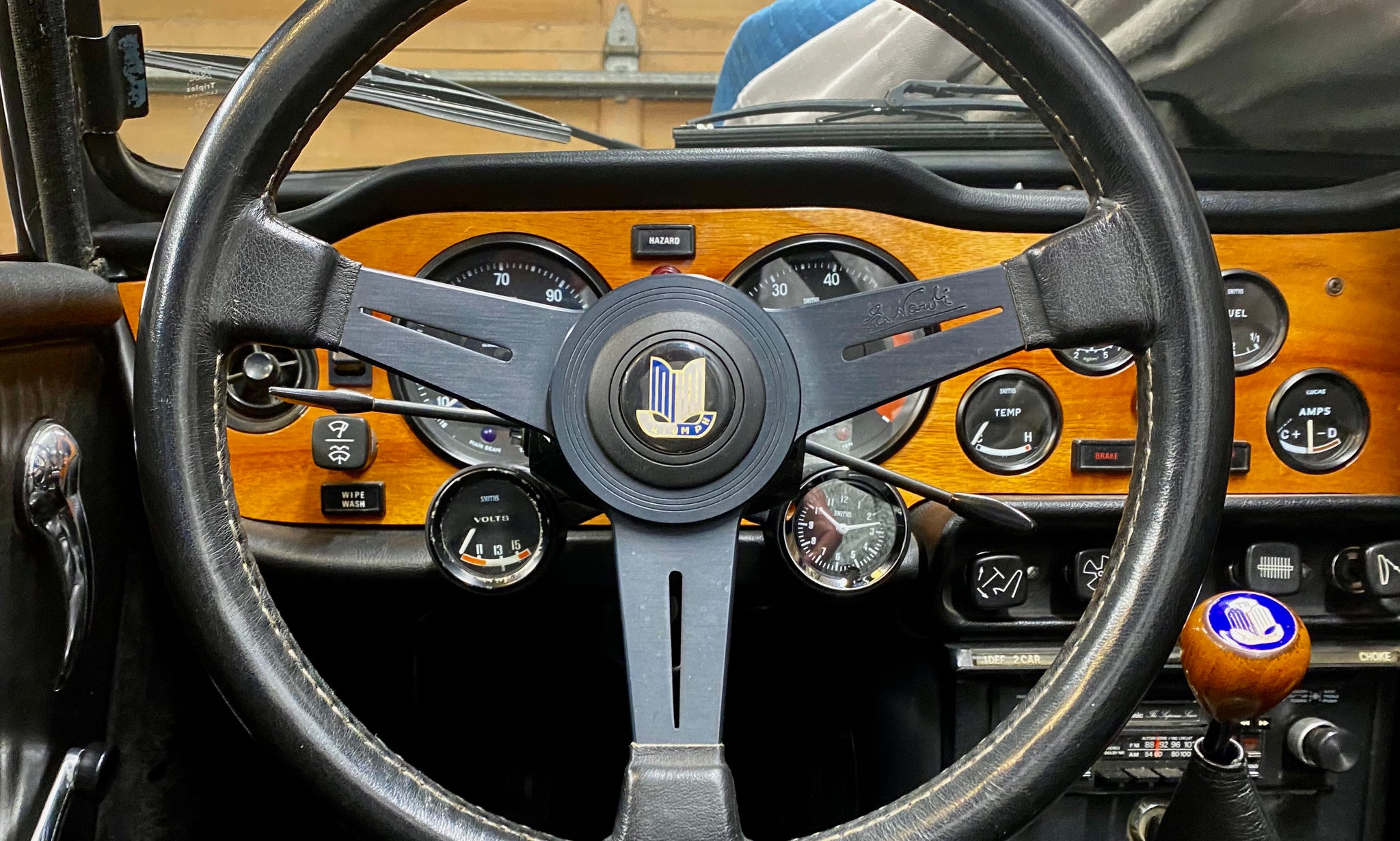
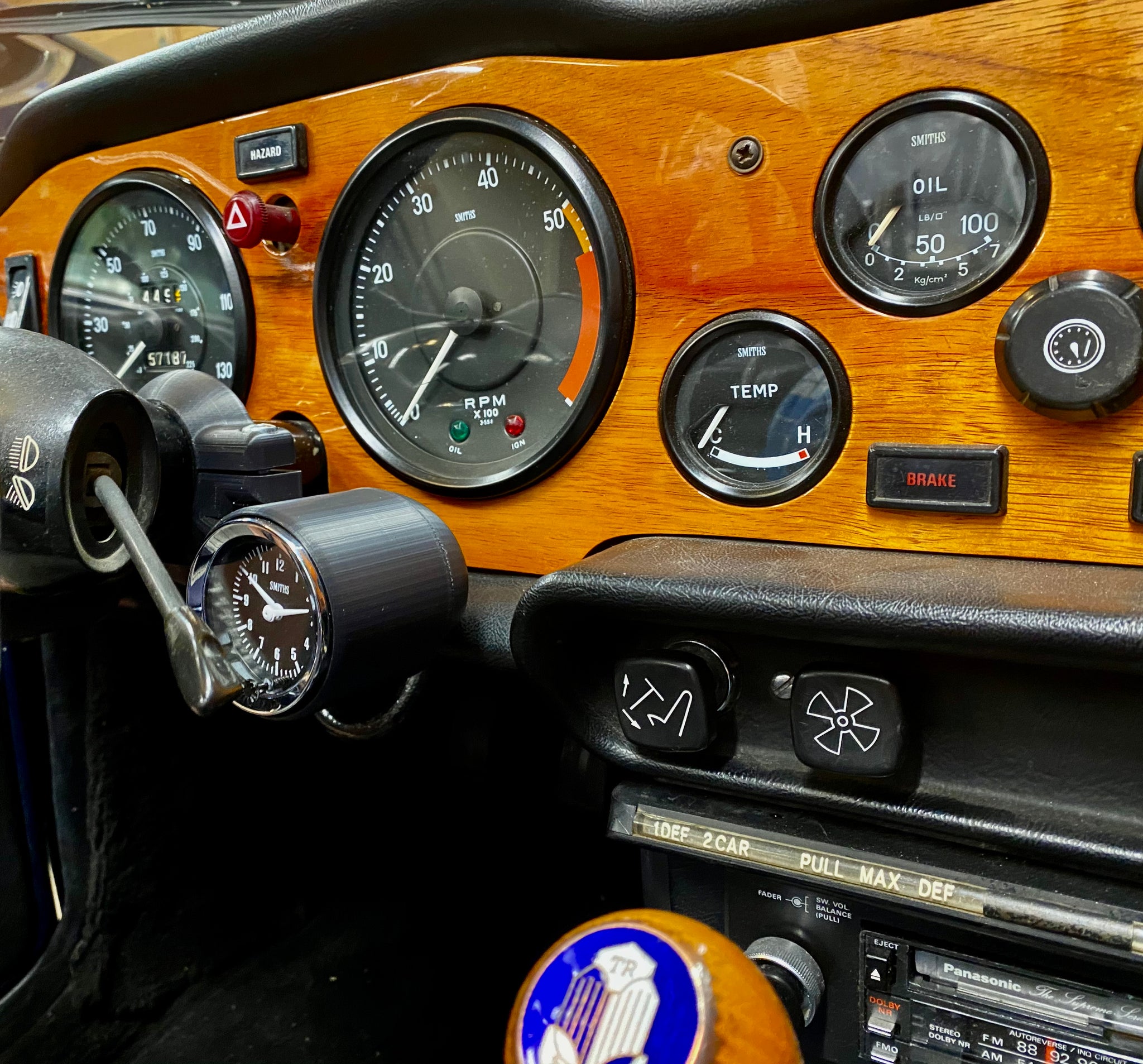
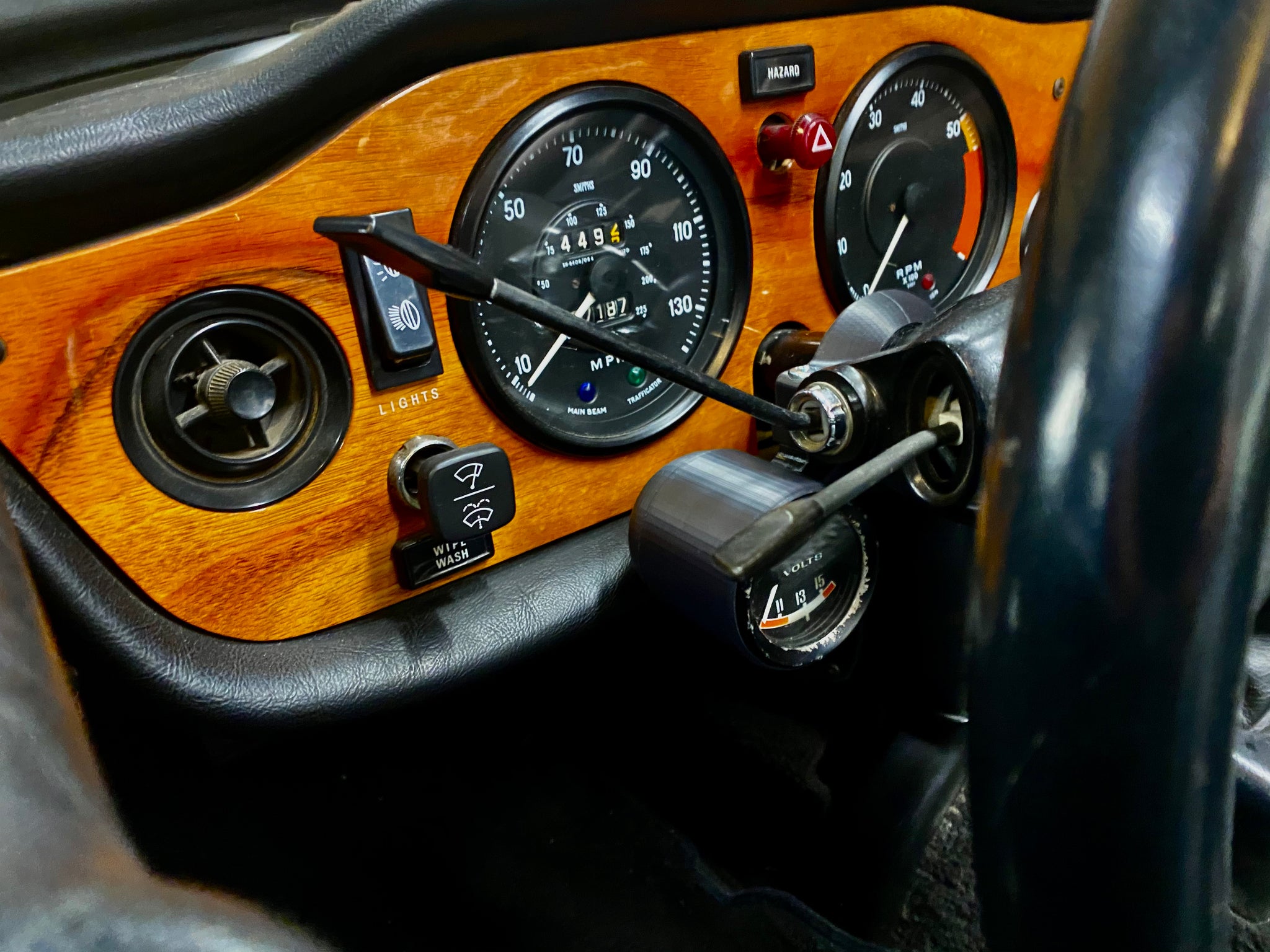
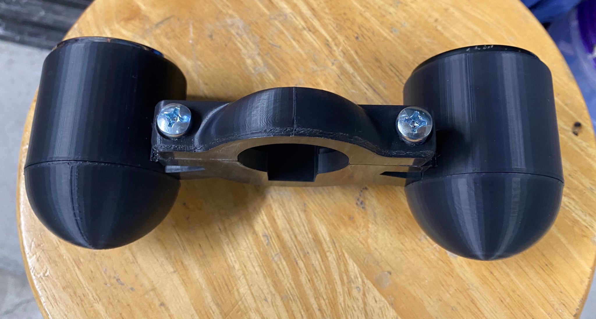
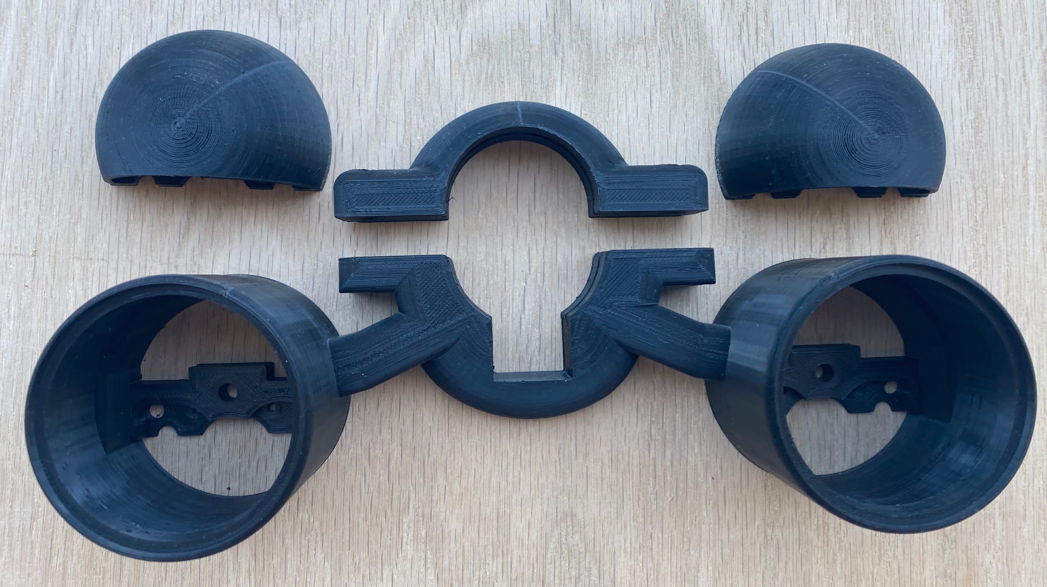
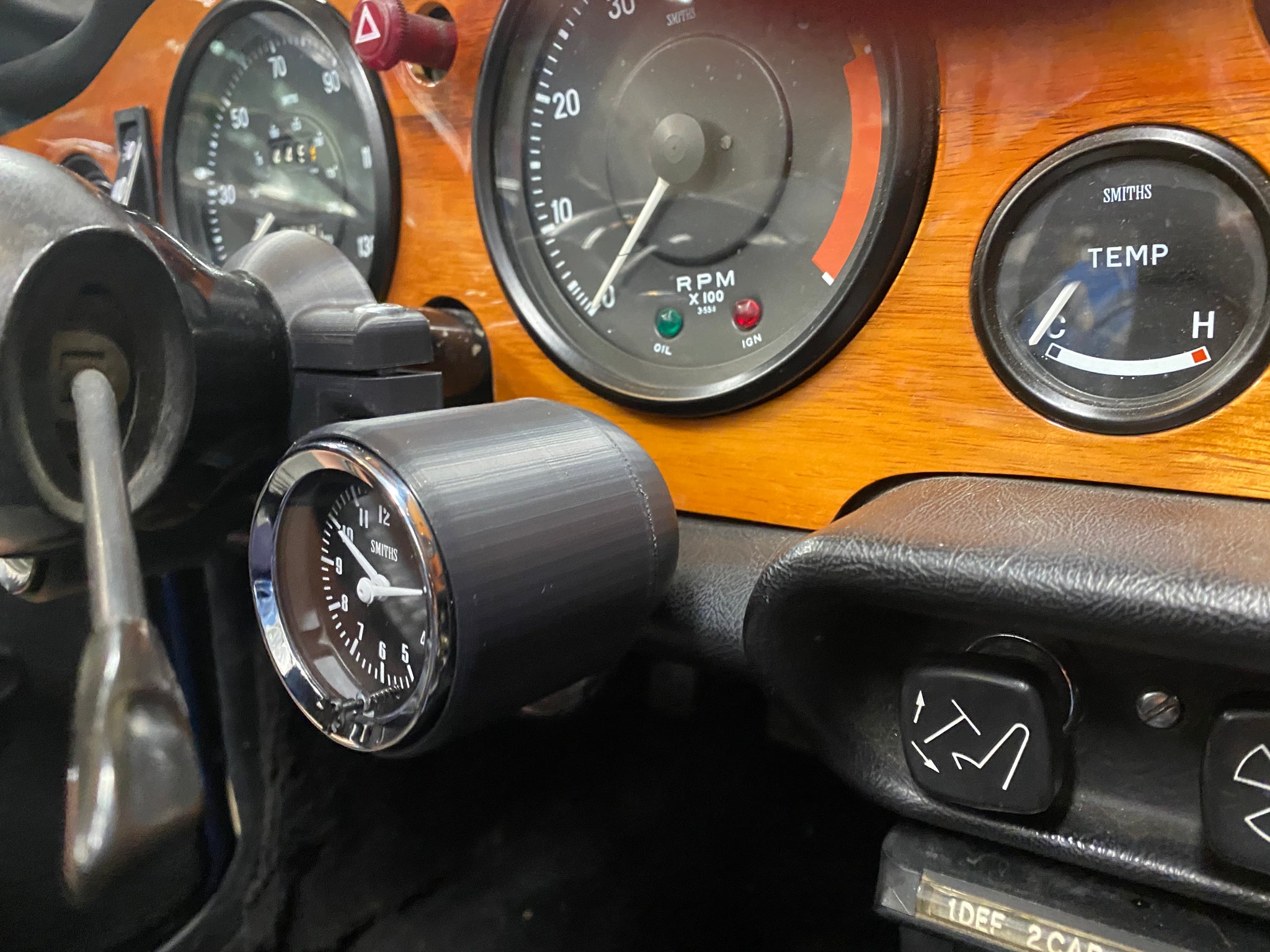
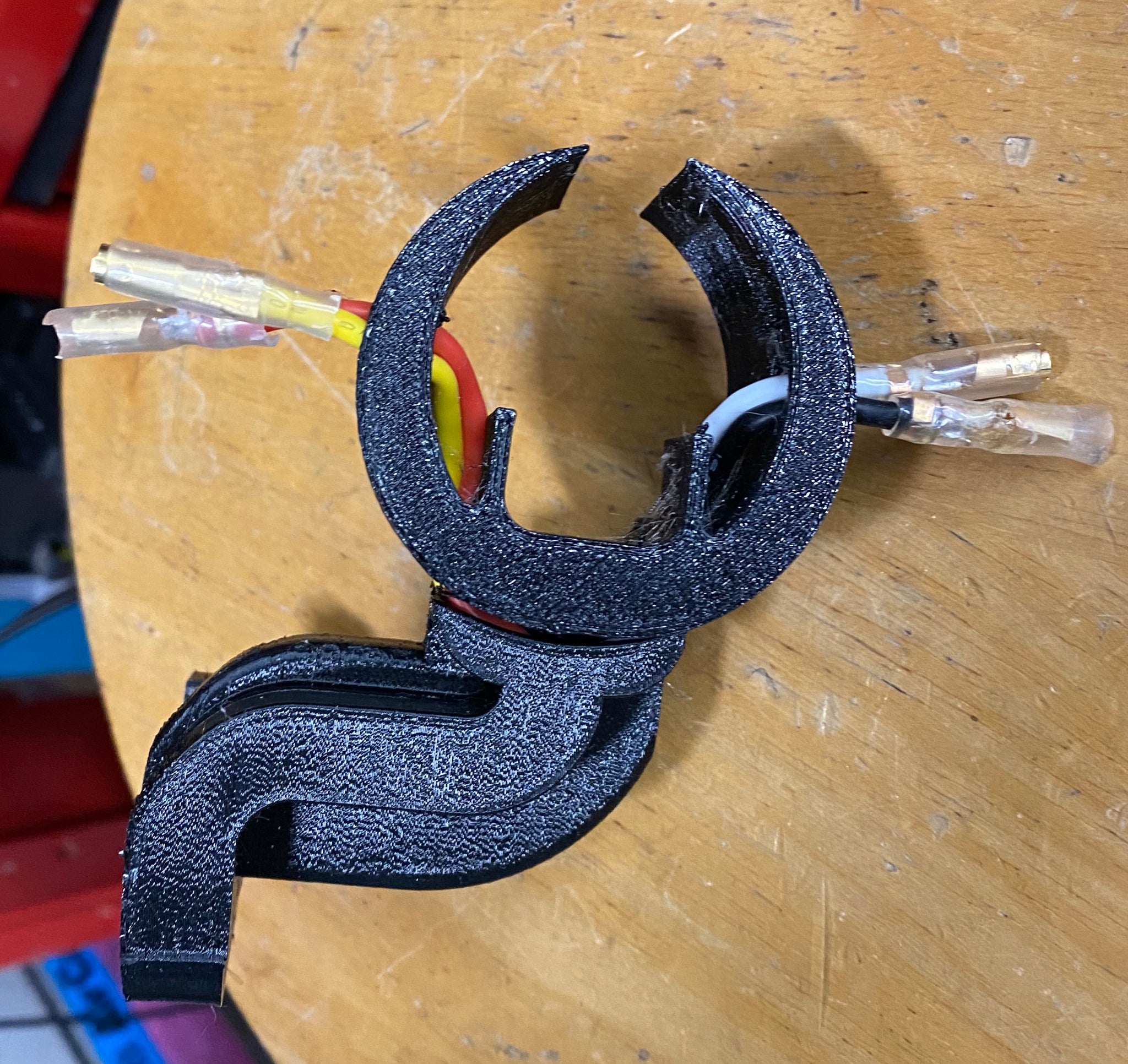
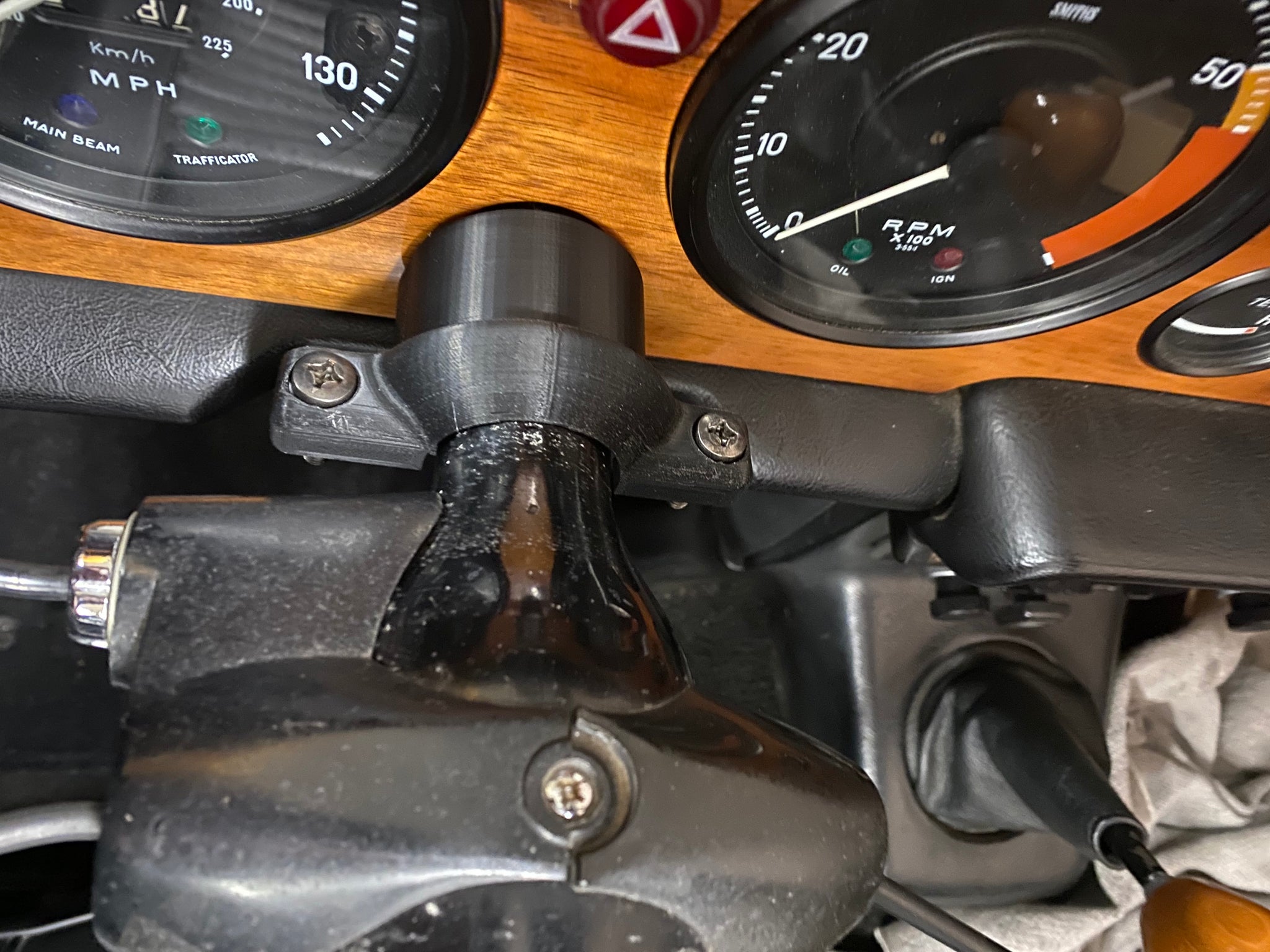
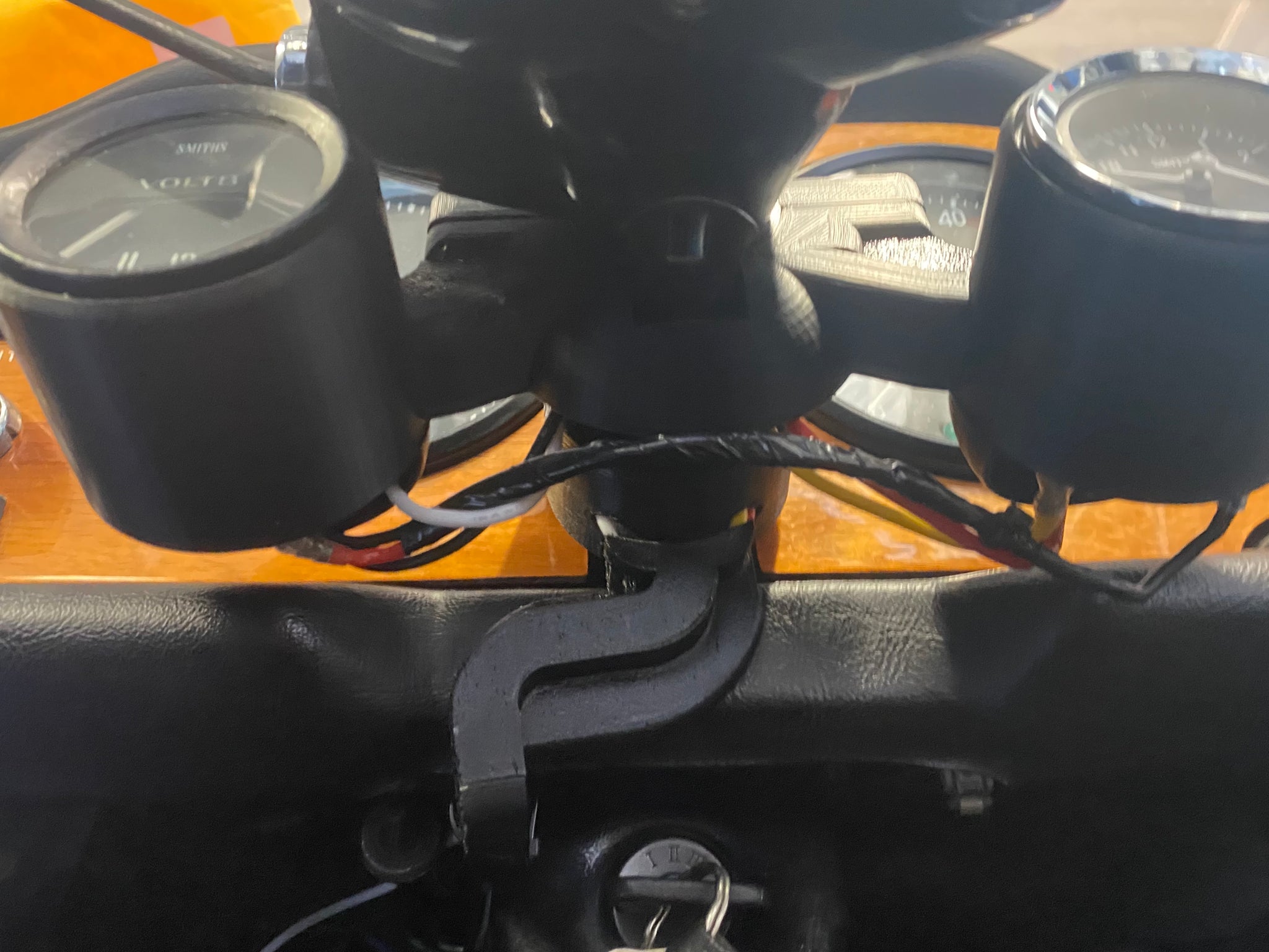
Silver Stand Design presents the Triumph TR6 Rally Pac. This will mount two 52mm gauges to your steering column.
Put away your hole saws, requires no alterations to your car. Just install and tighten the clamp
Does not block line of sight to your existing gauges or controls
Designed not to interfere your legs when you are getting in out of your car
Totally reversible. Does not alter your car at all.
Adding gauges to the TR6 has always been a problem and there always have been compromises that need to be made. The Rally Pac has the issue of the gauges becoming blocked by the steering wheel spokes. This is unavoidable given the lack of other choices so mounting a fuel or oil pressure gauge in the Rally Pac isnt a good idea.
In the case you see here, the Rally Pac is shown with a clock and voltage gauge. A vacuum gauge would also be an excellent choice.
The Rally Pac is available in two materials:
ABS: Strong, durable. Its color is a close match to the black paint on your steering column.
ASA: An advanced form of ABS. I am new this material but its reputed to be even stronger and has enhanced resistance to UV light. Its color if more of a satin, very dark gray. It contrasts a bit from the color of the steering column but not unpleasantly so.
Either material is going to well work well in your TR. Each material has its advantages.
Hardware: Stainless Steel and available in either in Bright metallic or Dark color.
Each unit is carefully 3D printed in the USA, they take a while to produce so if orders are brisk, this may cause a delay. But I will ship first-come-first-served.
Gauges are not included. You have to find those, but thats part of the fun!